Hi there
I'm Carly 👋I'm a content, product and UX designer.
Great UX starts with understanding the problem before pixels.
From mobile apps and web portals to wearables and vehicles, I've designed experiences across a variety of products.
I have a content-first approach, making rich designs and solutions that are always intentional and never distracting.
.

DAILY UX WRITING CHALLENGE

Day 1: Inclement Weather
A traveler is in an airport waiting for the last leg of a flight home when their flight is canceled due to a severe storm at their destination.
How does her airline app tell him this and what does it say?
Headline: 45 characters max
Body: 175 characters max
Button(s): 25 characters max
My challenge: conveying the appropriate amount of empathy for this traveler while staying within the confines of the character counts.
With the title, I tried to be as succinct as possible, giving a reason for the cancellation and including the flight number so Jeff knows it's his final leg that's disrupted (he could've taken multiple connecting flights before this one).
Within the body, I needed to tell him:
1. The flight was canceled;
2. This is for his safety;
3. There's accommodations available until the next flight.
His next step is to wait for the flight, so the button gives Jeff some peace of mind knowing his hotel room is paid for. Since the voucher opens as a PDF, I maximized the button character count to include a support option should he have trouble opening the document on mobile or redeeming it at the hotel concierge.
Day 2: Sports Updates
A user is a big sports fan in the midst of their favourite college sports season.
Headline: 45 characters max
Body: 175 characters max
Button(s): 25 characters max
My challenge: writing a home screen for a sports app that lets them pick their favourite college sports teams and sends them reminders to watch games, live score updates, and highlight videos after the game—all without having much sports expertise!
I might not know a lot about sports, but I know that fans are fiercely loyal to their favourites. Teams are something so personal, that they're the inspiration behind clothing, home décor themes, and even tattoos.
I started my headline with an emphasis on personalization. My dad who is a die-hard Boston Bruins fan would not want to see a notification about how the Montréal Canadiens are on a win streak. The ability to select which games and leagues are his "favorites" would be a killer feature for him.
The type of sport isn't specified in the app's description, so I focused on the big 3 in North America: football, basketball, and hockey. Next, I touch on all of the features for this app. Words like "instant" and "relive" attempt to capture the fast-paced energy felt from any Sportsplex.
Our button circles back toward this notion of personalization, allowing the user to select the teams that matter most as step one of onboarding.


Day 3: Sign in Error
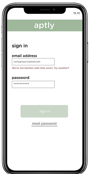
The user entered the wrong email address to sign in to their account.
40 characters max
Sometimes, thumbs go on autopilot when you're signing in with your credentials. Because signing into websites and apps is such a ritual, errors when it comes to passwords or email addresses can go unnoticed, leaving you stumped and incessantly tapping Sign in anyway!
I swear, that's the right address!
These messages need to be both useful and thwart frustration. I thought "We're not familiar with that email." was equal parts helpful and friendly, giving the user a little nudge toward what they can fix. In this case, it's a simple typo: .con
This message isn't designed only for those that are too quick with their keystrokes, though. "Try another?" aims to help those users that might have multiple email addresses that they juggle or use equally across platforms.
There were no brand guidelines to refer to when drafting, but I really wanted to explore a more creative tone for this challenge. It's a different approach to the tried and true (and often robotic) "Incorrect email."
Day 4: Caffeine Delivery
A user is in their favourite supermarket. They open the supermarket’s app on their phone to see what’s on sale.
Headline: 45 characters max
Body: 175 characters max
Button(s): 25 characters max
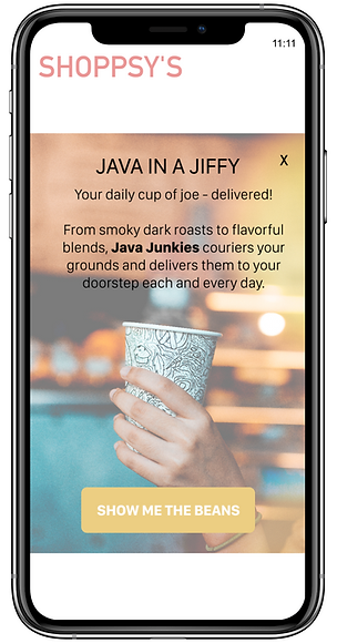
My challenge: write a promotion message that converts the user into subscribing to a coffee delivery service. The service delivers coffee beans once a day, every day for an entire year.
This challenge was more copywriting focused than others, but I still started my drafting process thinking about where the user was situationally: in a store, trying to see what's on sale that day. They could have their hands full of groceries, need to quickly pick up supplies for a dinner party, or even have children running up and down the aisles.
Instead of using every coffee pun under the french press, I used alliteration and emphasized speed to harness attention in the headline.
I affectionately call coffee my "writing juice" but I'm no expert. When writing the body, I wanted to illustrate that there's options for coffee connoisseurs. I quickly did some conversational mining, taking terminology from coffee lover forums and subreddits to pepper the description with words like "smoky" and "flavorful."
The CTA brings a playful tone that will hopefully get this shopper to the coffee blend selection.

Day 5: Unsaved Changes

While editing a note in a note-taking app, a user’s phone suddenly runs out of power and abruptly turns off. After the phone recharges, the user opens the app.
Headline: 40 characters max
Body: 140 characters max
Button(s): 20 characters max
Writing a message that the user will read after re-opening the app was my challenge. With such little character affordance, I needed to balance the following within my text:
-
The app closed without autosaving
-
What the user's next steps are (if any) to recover lost changes
For my headline, I wanted something that described what happened in laser-focused detail. There were no brand guidelines associated with this challenge, but I knew that users of note taking apps are generally savvy in recognizing good tone and grammar. As a writer myself, it's extremely frustrating when I lose content I've drafted (been there, done that, bought the t-shirt). I crafted a full sentence, speaking in the second person instead of a detached and potentially insensitive sounding "Changes lost."
The body. Here's the meat and potatoes of what happened and what needs to happen next for the user. With the screen real estate I had, I directed the user first to their Drafts to see notes that were autosaved. Because I didn't have many characters left, I encourage them to visit the help center for further troubleshooting (if their draft isn't salvageable).
As someone who manages a knowledge base, I know first-hand that self service support is an often under-utilized avenue for customers. Highlighting the option here gives them a second chance at restoring a missing note.
Day 6: Rainy Commute
It’s a rainy Monday. A user has just gotten into their car to drive to work. They plug their phone into the car and start driving.
Headline: 30 characters max
Body: 45 characters max
My challenge: let the user know there’s a heavy thunderstorm happening near their place of work. It might prolong their commute.
This headline is short and snappy (in the best way). I imagined a message like this appearing on their phone's lock screen after the phone connects to the car over Bluetooth. If the user is plugging in their phone before their commute, they are probably going to use a navigation app to outsmart traffic or put on a playlist before pulling out of their driveway. A message that is front and center and communicates the need-to-know is paramount. I also love the duality of Heads up here, informing the user to both pay attention and literally keep their head up, drive without distraction.
With a character limit of 45, I had to be smart with the body. I wanted to convey that driving conditions were going to be poor, and the user should be prepared for that. Giving a gentle reminder as well as a realistic description of what to expect from traffic, it's the perfect, to-the-point message for any frantic commuter trying to leave on-time.


Day 7: Quick Sports Update
A sports fan is at a wedding while his team is playing their arch-rivals. His team makes a touchdown.
Headline: 30 characters max
Body: 45 characters max
More sports action here, but with a different challenge: letting the fan know about the latest play, current score, and key players—quickly!
Streaming the game on your phone isn't the most polite thing to do during a wedding ceremony, so it's imperative that this notification gets the job done. Our headline nails the important stuff right away, visually communicating the highlight (the touchdown) in uppercase letters.
For the body, I had to bring myself back to the days where I sat in the passenger seat of my dad's truck as he listened to sports radio. Sports commentators are known for their quick, linguistic flair. They need to reference the right players at the right time to paint an accurate picture for the listener. I borrowed as much as I could from them, using the scorer's last name paired with the active verb "secure" to make this update exciting and accurate for the fan.
Day 8: New Recipe
The user is an amateur cook and a devoted foodie who follows several food blogs.
Headline: 30 characters max
Body: 45 characters max
The challenge: tell the user that a cauliflower recipe from their favourite blogger is available in a mobile app.
It wasn't clear whether or not this notification would be within the app or just from an app, so I decided to create a ribbon-like notification for a fictional app called Table.
I imagined this being a fun, food-loving brand, so I kept the tone light and started with a nod to the social aspect of food.
For the body, I capitalized Table so that it's distinct and alludes to the app's name. Since the user follows many cuisine curators, I mentioned the blogger by name "Sam" and plugged the title of the recipe.


Day 9: Expired Card
The user is trying to rent a car using an application, but the credit card they have on file has expired.
Headline: 30 characters max
Body: 45 characters max
Error messages need to be helpful. For this challenge, I needed to give the user direction on where they can update their payment information in order to complete the rental.
The headline wastes no time explaining why the user couldn't submit their request. I find it's always best to be direct and say what went wrong rather than wordsmith something clever.
I'm a fan of using the second person to make text more approachable and human, so that's why you'll see it within the message's body. The imperative can make you sound like a drill sergeant though, so I offset this by using the pronoun "your." It would've sounded too robotic had I just said "...update cards from Profile."
Day 10: Car Shopping
The user is trying to view a website to help them buy a car. But, the content can’t load without the user’s location.
Body: 45 characters max
Button(s): 15 characters max
This challenge involves asking the user for their ZIP code and name without being creepy about it.
I have less content to work with, so the body had to sound like a person—not a scummy site scavenging for your personal information. I settled on "let's get to know each other" because it's not outright saying "Give me your information" and invites a conversation. It also implies a more personalized experience.
I'd recommend some more content design work to really make this process as smooth as possible. Notice how I included a Not Now button to opt out. If a user selects this option, they'll be taken to a different page that explains why Automart needs this information:
In order to give you the best car matches, we need to know your name and ZIP code. This will help us search the nearest Automart locations for you.
This gives the user some closure and more details should they want to proceed or stop shopping.
If the user selects Let's Go, they'll be taken to a screen that asks for their ZIP code:
Hello! First, let's check Automart locations closest to you.
What's your ZIP code?
After entering their ZIP code, the user can then select a location that works best:
Greg is going to be your consultant for Automart Boston.
Collecting a list of cars at this location can take 30 minutes.
Can you enter your name and email? We'll let you know when it's ready.
Looking at the broader design from a content-first approach results in a way more personalized—and not a smidge creepy—experience.


Day 11: Contacts Delivered
An elderly user is doing a Google search to find an easy way to buy contact lenses online.
Title: 60 characters max
Meta Description: 160 characters max
Challenge: Write a title and meta description for a website that sells subscription contact lenses delivered to a user every 30 days—convince them to try it.
More copywriting with an SEO twist. For this elderly user, so I decided to keep the title plain and clear: "Shop and Subscribe Online." Slang and youth lingo need not apply.
My experience in the eyewear industry was a real advantage when drafting the description. Contacts can be disposable (labelled daily) or reusable (monthly). Most contact lens subscriptions are for daily lenses, so I specified this within the description.
Next, I plugged prescription support. As we age, our vision deteriorates. I knew that corrective lenses would be top of mind for this customer, so I focused the language on prescription rather than something cosmetic like coloured lenses.
Finally, we have the length of the subscription (30 days) as well as the pricing up front. The free shipping incentive will hopefully be enough to get this user to convert.
Day 12: Fraud Detection
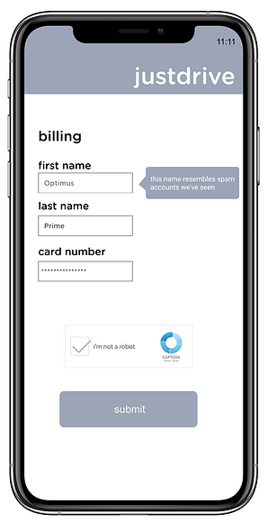
A user is creating an account. When they come to the step where they are asked to enter their name, they get an error message. A fraud detection software thinks their name is fake—but it’s wrong 5% of the time.
Message: 45 characters max
Challenge: Write an error message that prompts them to fix the error without shaming them for having a fake-sounding name.
This was the most ambitious challenge yet. In fact, had this been a real scenario, I'd see if we could revisit the implementation of the fraud software. Fraud detection needs to look at other parameters—like location and billing information—and not just names.
I didn't want to give a fraudulent user the opportunity to circumvent this error, either. The software might be wrong occasionally, but the scenario didn't specify whether the user was actually fraudulent or not. We shouldn't assume every user will be honest with us while drafting.
I settled on "This name resembles spam accounts we've seen." Using every ounce of character space, I think this is equal parts accurate and non-judgemental.
Another recommendation I'd make is including a Captcha as a way for users to prove they're not a bot. Tricky challenge, but I feel great with my proposed messaging.


Day 13: Password Reset
A user is trying to log into an account but they don’t know the password—they want to recover their password via a secure email sent to an email inbox.
Subject line: 65 characters max
Body: 200 characters max—including headline and body.
Button(s): 25 characters max
Challenge:
Write a password recovery email. Including the subject line, headline, body copy, and call to action.
With security top of mind, I needed to make sure I got the user's attention and while outlining steps they need to complete to recover their info. I decided to be direct in the subject line, saying exactly what they are expecting from the message: "Recover your account password."
The body. Had I more characters, I would've loved to expand on why they're receiving this message and what they could do if they didn't request this change to their account. As much as we can trust this user is the true owner of this account, there's always the possibility that the account's been compromised and that the owner should be weary if they didn't ask for a password recovery.
Because the user requested a secure email, I added the tidbit about the verification code as well as how this is a link unique to them and will expire if they don't take action.
Speaking of action, the CTA reiterates what this email is for and sends the user to their account settings where they verify their identify with the verification code.
Day 14: Unknown Error
A user is shopping using a price comparison app that boasts “REAL-TIME” pricing on items. As they are checking the price of an item, something goes wrong. The problem is unknown.
Headline: 30 characters max
Body: 120 characters max
Button(s): 15 characters max
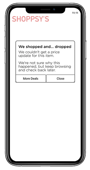
My challenge was to write a message that informs the user that they can't access the app right now. I couldn't specify "why" the app doesn't work (since the problem is unknown), but I still want them to continue to use the app.
This was another scenario where I imagined a fun brand vibe, so I started the headline with a clever nod to a common shopping expression. I find that it softens this particular message, making the error less devastating to the user. Using "We" as the subject here also helps shift accountability for the error to the app—not the user. Error messages tend to make users feel guilty, so I really wanted to illustrate that this was the app's fault. The user did nothing wrong.
Even though there's not much the user can do to fix this, I still like to give some direction when writing messages like this. For the body, I started by explaining what went wrong (mysterious error) followed by a suggestion on what they can do next: keep browsing (continue to use the app) or try again later.
Buttons. I wanted to give the user an easy way to get back to relevant price updates. "More Deals" gives them the option to go to the app's recommended sales and "Close" gives them the opportunity to plan their own path within the app.
